Flexbox (CSS)
The main idea of CSS Flexbox
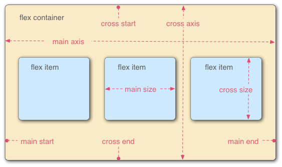
Basic idea
(image source )
- Flex container = parent element with
display: flex - Children of container = flex items (their size and position is determined by flexbox)
- Main axis = direction in which the chldren of the container are laid out
- Horizontal if container has
flex-direction: row; - Vertical if container has
flex-direction: column;
- Horizontal if container has
- Cross axis = direction perpendicular to main axis
- Note: Flexbox is mainly suitable when you want your items to adjust their sizes to their container along a single direction (either horizontally or vertically). If both horizontal and vertical sizing is important to you, Grids may be a better option.
Sizing of flex items
You can control the sizing of flex items along the main axis by setting their flex property (see flex for a bit more details)
The flex property can have up to 3 values:
- Flex grow: a unitless proportion that indicates the extent to which the item will grow with its container
- Flex shrink: a unitless proportion that indicates the extent to which the item will shrink (if needed) to fit the container
- Flex basis: the minimum size of the item
Alignment of flex items
Alignment along the main axis: justify-content (set at the level of the container)
flex-start(default): make items sit towards the start of the main axisflex-end: make items sit towards the endof the main axiscenter: make items sit towards the center of the main axisspace-around: evenly distribute items (same amount of spacing between adjacent items) and leave half of that spacing at the start and end of the main axisspace-between: evenly distribute items (same amount of spacing between adjacent items), without any spacing at the start and end of the main axis- Simple use case: two elements, one sticking to the left side of the container and one sticking to the right side of the container
Alingment along the cross axis: align-items (set at the level of the container, can override at the item level using align-self )
stretch(default): make items fill the parent along the cross axiscenter: center items along the cross axisflex-startorflex-end: start or end of cross axis
Wrapping
You can make your items wrap to a new row/column as necessary using flex-wrap: wrap; on the container
Use cases
Some use cases for Flexbox:
- Vertical centering
- Sticky footer (sticks to bottom of screen if content doesn't fill screen)
- Make an element take up all of the vertical space that is not yet taken up by other elements
- Make the children of a container scale along with the size of the container
- Show the children of a container side-by-side and make them have the same height, even if their content doesn't take up the same height